Cold open
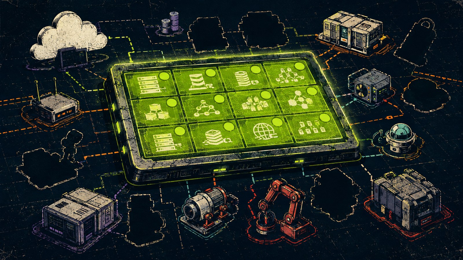
The dashboard had forty-seven green tiles, three executive fans, and no one in the meeting who could name the population behind tile number nineteen.
The scene
The assurance program looked unusually calm. A weekly report arrived on schedule, control owners received cheerful summaries, and leadership saw a wall of green that appeared to answer every uncomfortable question before it could be asked. The dashboard was not fabricated. It was fed by real scans, tickets, inventories, and workflow data. The team had invested serious effort in building it.
What the dashboard concealed was not failure but variation. Several business units used different asset sources. Acquired environments joined on delayed schedules. Cloud accounts appeared through one integration while inherited appliances appeared through another. A green tile meant the query returned a favorable result for the records it received. It did not mean the team had established that those records represented the population everyone thought they were discussing.
Narrative turn / 01
The simple question
The trouble began when a reviewer asked for the denominator. Tile nineteen showed 100 percent completion. One analyst said it covered production servers. Another said it covered assets enrolled in the endpoint platform. A third opened the query and discovered it covered active records in one inventory table with a particular ownership tag. All three descriptions sounded adjacent. They were not equivalent.
The team downloaded the source rows and compared them with the architecture inventory. The dashboard had tested every record it had been configured to test. It had also never seen two inherited network zones, a recently acquired cloud account, or devices whose ownership tags were blank. Green accurately described the selected dataset. It said nothing about the missing population.
Narrative turn / 02
The evidence echo
Because tile nineteen looked authoritative, it had been reused. A screenshot appeared in three control narratives, two committee decks, and an evidence package. Each reuse acquired a slightly broader caption. Endpoint completion became server coverage. Server coverage became infrastructure coverage. Infrastructure coverage became evidence that the environment was complete.
No individual reuse seemed reckless. The screenshot was current, legible, and green. The Wack accumulated in the distance between the original query and the claims later attached to it. One result had become an Evidence Echo: repeated often enough that nobody returned to the source to ask what the signal could and could not prove.
Narrative turn / 03
Following the green backward
The team chose one tile and walked backward. They documented the displayed metric, query logic, source table, inclusion filters, excluded records, refresh time, exception behavior, and accountable owner. Then they walked forward: which narratives, decisions, and reports relied on the result? The exercise took less than an hour and changed five documents.
The most important discovery was that the tool was working as designed. The problem lived in the unowned translation between telemetry and assurance. Once that translation became an artifact, the team could reconcile inventories, represent the missing variants, and state precisely what the tile meant. Green survived—but it became a conclusion with provenance instead of a color with charisma.
What the team finally saw
Dashboard Delusion does not require a bad dashboard. It appears when a summarized status is asked to carry an unstated population, method, period, exception path, and conclusion. Sampling Mirage and Evidence Echo then amplify the gap: the unseen assets stay unseen, while the same clean result spreads across increasingly ambitious claims. The fix is not to distrust automation. It is to make the evidence chain visible enough that a human can explain every translation.
What changed
The team did not throw away the dashboard. They made it better by attaching population definitions, freshness indicators, exception counts, and evidence links to the highest-impact tiles. They also retired the screenshots whose captions had outgrown the result. Leadership still saw green, amber, and red—but now those colors led somewhere.
Tile nineteen ended the quarter at 93 percent instead of 100. Strangely, confidence in the program went up. The number had become less flattering and more trustworthy. The dashboard stopped pretending to be the whole control and started doing its real job: helping people find the evidence chain.